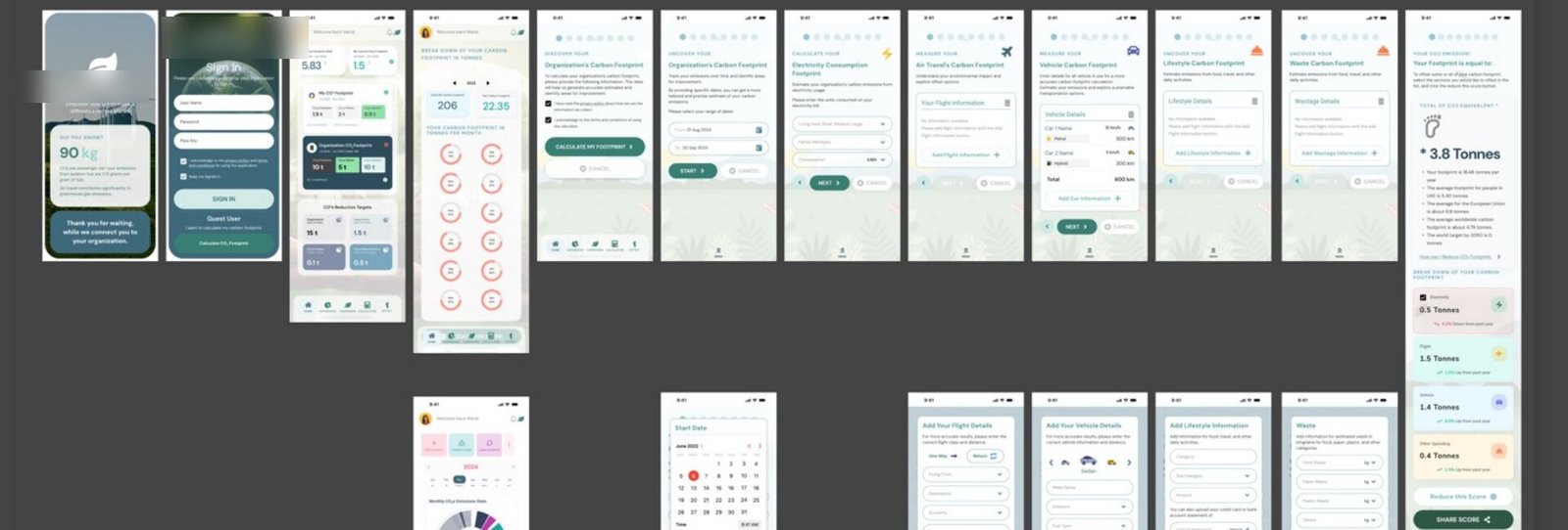
MVP screens designed
End-to-end delivery roadmap
Surfaces: web, mobile, marketing site
Structured UX phases
Everything the platform needed, none of the clarity users did.
Background. The platform is a dual-interface digital ecosystem that helps organisations and individuals measure, track, and offset their carbon emissions, combining footprint calculation, sustainability reporting, and a carbon-credit marketplace into a single experience across web and mobile.
It had breadth. What it lacked was an experience non-technical users could trust: onboarding was heavy, emissions data was hard to read across levels, and the credit-purchase flow needed the clarity of a financial product.
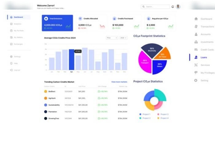
More than a redesign, a chance to make sustainability data legible, and to turn intent (calculate, understand, offset) into a product people trust like a financial tool.
The Opportunity
Simplify onboarding for both organisations and individuals into the sustainability ecosystem.
Deliver accurate, questionnaire-based carbon footprint calculation.
Visualise emissions data at individual, company, city, and country level.
Enable seamless carbon-credit purchase through an integrated marketplace.
Build awareness through campaigns and educational content.
A modular product built to grow, clear enough for non-technical users, scalable enough for new markets.
Modernise a data-heavy platform into a modular, trustworthy product, one that turns the user's real decision path (calculate → understand → offset) into a fast, legible experience.
Complexity over clarity. Dense sustainability data was hard for non-technical users to interpret and act on.
Data that wouldn't scale visually. Emissions insight needed to read cleanly from individual all the way to country level.
Trust gaps in payments. Credit-purchase flows needed the clarity and confidence of a financial product.
A UI that couldn't grow. New modules and markets were coming; the interface had to scale without breaking.
Flow vs. behaviour mismatch. The real path, calculate, understand, then offset, wasn't reflected in the experience.
Product Design Lead.
Directed the UX strategy and information architecture, and collaborated with a small product design team: Product Design Manager, Senior Product Designer, and Product Designer, across a sprint-based MVP delivery model with iterative feedback loops.
- Directed UX strategy and IA aligned to product and mission outcomes.
- Defined the MVP screen system and user journeys for guest, individual, and company roles.
- Led mobile-first UI, prioritising the core actions: calculate, view dashboard, purchase credits.
- Expanded the IA into data-rich web dashboards, comparative analytics, and admin views.
- Ran usability testing and iterative refinement across user segments.
- Managed developer handoff and interface specifications.
From discovery to handoff, an iterative, sprint-based engagement.
Discovery & Research
Stakeholder interviews and carbon-accounting research grounded the product in real regulatory and reporting needs before a single screen was drawn.
The product was anchored to how carbon reporting actually works, not assumptions about it.
Information Architecture
Defined core modules, the MVP screen count, and user journeys for three roles, guest, individual, and company.
Structural clarity locked in before visual design began.
Wireframes & Mobile-First UI
Structural layouts were validated for navigation logic and content hierarchy, then built mobile-first around the core actions, calculate, view dashboard, purchase credits, in a modular, scalable screen system.
- Guided carbon-calculator flows: flights, vehicles, electricity, lifestyle spend, and waste.
- Onboarding through to footprint breakdown.
- A modular component system designed to expand with new modules and markets.
A testable mobile foundation reflecting real user journeys.
Web Expansion
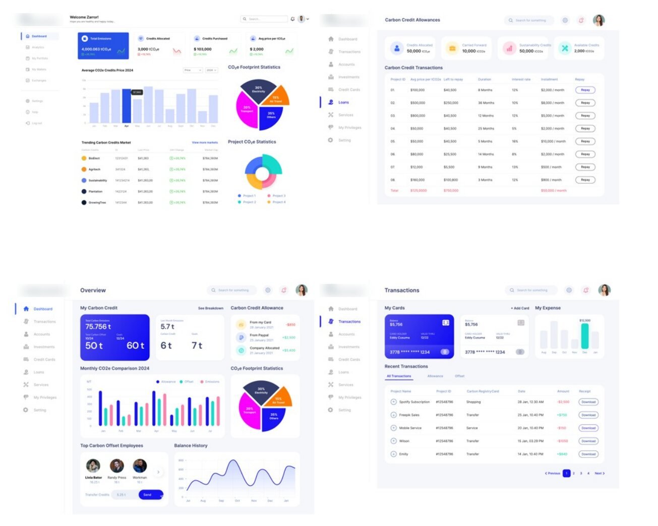
Extended the mobile IA into data-rich dashboards, comparative analytics, and administrative views, carrying the same clarity into a denser surface.

Emissions data made legible at every level, individual, company, city, and country.
Testing & Handoff
Interactive prototypes were tested and refined, then handed to development with iterative feedback loops.
A complete visual blueprint that let the team build the MVP with confidence and less rework.
One system, three journeys.
- Understand the platform quickly.
- Try a footprint calculation with no commitment.
- See why offsetting matters.
- Calculate a personal footprint accurately.
- Understand emissions in plain language.
- Purchase credits with financial-grade clarity.
- Track emissions across teams and sites.
- Compare and report at company, city, and country level.
- Manage allowances, transactions, and admin.
What the transformation changed.
| Dimension | Before | After |
|---|---|---|
| Onboarding | Heavy, unclear | Guided questionnaire |
| Data legibility | Flat, hard to read | Multi-level dashboards |
| Credit purchase | Opaque | Financial-grade clarity |
| Scalability | Fixed layouts | Modular system |
| MVP screens | 26+ designed & specced |
Designing the full ecosystem: 26+ MVP screens.
Across web dashboards, a mobile carbon calculator, and a public marketing site, every critical journey was designed end-to-end, from nuanced data states to edge-case flows, giving the development team a complete visual blueprint.
Five principles guided every screen.
Clarity over complexity. Simplified sustainability data for non-technical users.
Data transparency. Clear visualisation of emissions and offsets at every level.
Scalability-first. A modular UI built to expand with new modules and markets.
Behaviour-driven UX. Designed around the real path: calculate, understand, then offset.
Trust & financial clarity. Purchase flows built with the confidence of a financial product.